Articles in the development category
I love blogging. I hate blogging systems. I hate content management systems. I just want to blog. That’s what PieCrust is all about - it lets you blog.
It is powerful static website generator perfect for my needs (and for yours as well?). Blogging with PieCrust is really a piece of cake:
- prepare post
- serve site
- bake site
- send it off to the public
I love having clean OS. That’s what Docker is all about - for me. Running PieCrust on Docker is really easy, it does not clutter your PC and it just works.
If you ever want to use PieCrust on Docker, why don’t you start with this code?
FROM centos:centos6
RUN rpm -Uvh http://mirror.webtatic.com/yum/el6/latest.rpm
RUN rpm -Uvh http://download.fedoraproject.org/pub/epel/6/x86_64/epel-release-6-8.noarch.rpm
RUN rpm -Uvh http://rpms.famillecollet.com/enterprise/remi-release-6.rpm

RUN yum --enablerepo=remi,remi-php55 install -y php php-mbstring php-opcache php-cli php-pear php-common && yum clean all
RUN php -r "readfile('https://getcomposer.org/installer');" | php
RUN echo "date.timezone = Europe/Prague" >> /etc/php.ini
RUN mv composer.phar /usr/bin/composer
RUN php -r "eval('?>'.file_get_contents('http://backend.bolt80.com/piecrust/install'));"
RUN mv piecrust.phar /usr/bin/chef

CMD ["/bin/bash"]
Running sudo docker build --tag=piecrust . will result in having docker container ready to run. Just run sudo docker run -it -p 8080:8080 -v /host_piecrust_path/:/container_path piecrust /bin/bash in terminal. While in container terminal, run chef serve -n -p 8080 -a 0.0.0.0 and visit http://localhost:8080. You should see your PieCrust site up and running.
The last command tells chef to serve your site on port 8080 (which should be free unless you’re running Tomcat or something like that) and make it listen on every available network interface. If you used 127.0.0.1 instead, you would never reach your site from outside the container.
See? Easy.
I have found a nice way to get decimal value from degrees of longitude and latitude recently:
function format(coords) {
    var decimal = 0,
        output  = [],
        coords  = coords.split('  '); // it might be <br> as well

    for (var i = 0; i < coords.length; i += 1) {
        var c = coords[i].split(' ');

        for (var j = 0; j < c.length; j += 1) {
            decimal += c[j] / Math.pow(60, j);
        }

        output.push(parseFloat(decimal).toFixed(5));
        decimal = 0;
    }

    prompt('Souřadnice bodu', output.join(', '));
}
When you call format("DD° MM' SS' DD° MM' SS'"); you’ll get decimal value in return (or prompt to be accurate). What I like the most about this solution is the usage of Math.pow(). I think it is a neat way to transform the values as you need to divide parts of latitude or longitude by 600, 601 and 602 respectively.
There is definitely a googol of different solutions to this task, I just liked the simplicity of this one.
Printing a web map requires a lot more than doing Ctrl + P. MapFish seems to be the best option to use with Geoserver, and it comes ready as an extension. If you installed the module properly, you should be seeing general info at http://localhost:8080/geoserver/pdf/info.json. You’ll find a config.yaml in data_dir/printing.
MapFish lets you access three different points:
info.json that returns current config as defined in config.yaml fileprint.pdf that actually prints the map as defined in the spec GET argumentcreate.json that returns a JSON object with an URL of the printed map
Remember, if you’re displaying a lot of layers in the map and all of them should be printed, you need to pass it as a POST argument when calling print.pdf or create.json, otherwise you’ll be getting an error complaining about the GET request length.
The config.yaml file is where you define settings for the print module. You definitely want to define dpis (we’re using 90, 200 and 300 DPI), scales (they probably need to be hardcoded, I didn’t succeed trying any arbitrary scale) and layouts (we’re using A4 to A0 both portrait and landscape).
However, defining the page size might get tricky as MapFish does not use standardized sizes defined in cm, in or any other unit. I’ve experimenting and doing some maths and here’s what I came up with for portrait layouts.
| A0 |
A1 |
A2 |
A3 |
A4 |
| 2382×3361 |
1683×2380 |
1190×1680 |
840×1180 |
595×832 |
The bigger paper you use, the smaller DPI is available, that’s what I found out messing around with MapFish settings. This means that we’re using 200 DPI top for A2 layout and 90 DPI for A1 and A0 layout, respectively.
JQuery takes care of sending POST request and fetching the response. See it in action (Choose Nástroje and Tisknout for printing).
I am writing a diploma thesis focused on extracting spatial data from social networks. I have been working mainly with Twitter API and results I have got so far look really promising. This post was written as a reaction to many retweets I got when I shared one of my visualizations. It aims to make it clear how to connect to Twitter Streaming API using node.js, Leaflet and SQLite and retrieve tweets to analyze them later.
If you have any further questions after reading this paper, feel free to contact me via Twitter or e-mail. I must say right here that the code will be shared as well as the map, but there are still some bugs/features I would like to remove/add.
On a side note: I have been studying cartography and GIS for the last five years at Masaryk University in Brno, Czech Republic. I am mostly interested in ways computers can make data handling easier. I like to code in Python.
Using Twitter Streaming API
As you probably know, Twitter offers three different APIs:
- REST API which is obviously RESTful. You can access almost every piece of information on Twitter with this one: tweets, users, places, retweets, followers…
- Search API used for getting search results. You can customize these by sending parameters with your requests.
- Streaming API which I am going to tell you about. It is really different, as (again, obviously) it keeps streaming tweets from the time you connect to the server. This means, once the connection is made, it has to stay open as long as you want tweets coming to you. The important thing here is that you get real time tweets delivered to you via this stream, which implies you cannot use this API to get tweets already tweeted.
To sum it up: You get a small sample of tweets in a real time as long as the connection to the server stays open.
What you need
To use any of the Twitter APIs, you need to authenticate you (or your app) against Twitter via OAuth protocol. To be able to do so, you need a Twitter account, because only then you can create apps, obtain access tokens and get authenticated for API use.
And then, obviously, you need something to connect to server with. I chose node.js because it seemed as a good tool to keep connection alive. I have also been interested in this technology for the couple of months but never really had a task to use it for.
The good thing about node.js is that it comes with lots of handy libraries. You get socket.io for streaming, ntwitter for using Twitter API and sqlite3 for working with SQLite databases.
You need something to store the data in also. As mentioned, I picked SQLite for this task. It is lightweight, does not need server nor configuration to run, just what I was looking for. Seems we are set to go, right?
Filtering the data
I guess none of you is interested in obtaining random tweets from around the world, neither was I. I live in the Czech republic and that is the area I want to get tweets from. How?
It is fairly simple, you tell Twitter with the locations parameter of statuses/filter resource. This parameter specifies a set of bounding boxes to track.
To sum it up: you connect to the server and tell it you just want to get tweets from the area you specified with the locations parameter. The server understands and keeps you posted.
Is it that simple?
No. Twitter decides whether to post you the tweet or not according to what the value of coordinates field is. It goes like this:
- If the
coordinates field is not empty, it gets tested against the bounding box. If it matches, it is sent to the stream.
- If the
coordinates field is empty, but the place field is not, it is the place field that gets checked. If if it by any extent intersects the bounding box, it is sent to the stream.
- If both of the fields are empty, nothing is sent.
I decided to throw away the tweets with the empty coordinates field, because the accuracy of the value specified in the place field can be generally considered very low and insufficient for my purposes. You still need to account for position inaccuracies of users’ devices though, however that is not something that we can deal with. Let us just assume that geotagged tweets are accurate.

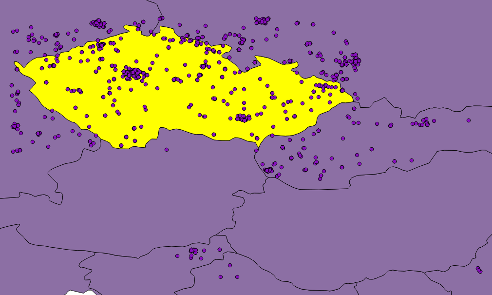
Figure: Twitter seems not to be very accurate when matching tweets against bounding box.
Although, as you can see in the picture, they are not. Or they are, but Twitter is not good at telling so. Besides that, none of the countries in the world is shaped like a rectangle and we would need to clip the data anyway. That is where SQLite comes in, because I have been saving incoming tweets right into the database.
If you use any GUI manager (sqlitebrowser for Linux is just fine), you can easily export your data to the CSV file, load it into QGIS, clip it with Natural Earth countries shapefile and save them to the GeoJSON file. It is just a matter of few JavaScript lines of code to put GeoJSON on a Leaflet map.
Displaying the data
Once a GeoJSON file is ready, it can be used for making an appealing viz to get a sense of what may be called “nationalities spatial patterns”. The lang field (stored in the database, remember?) of every tweet is used to colour the marker accordingly. Its value represents a two-letter language code as specified in ISO 639-1 document.
However, as those codes are guessed by Twitter’s language algorithms, they are prone to error. There are actually three scenarios we might be facing:
- User tweets in the same language as used in the Twitter account.
- User tweets in his/her mother language, but has set different Twitter account language.
- User does not tweet in his/her mother language, but has it set as a Twitter account language.
We basically have to deal with 2) and 3), because 1) means we can be pretty sure what nationality the user is. Sadly though, I have not found an easy way to tell which one of these two we came across, thus which language settings should be prioritized. I made an arbitrary decision to prioritize the language the tweet was written in, based on assumption that the most of the users tweet in their mother language. No matter what you do, the data is still going to be biased by automatically generated tweets, especially ones sent by Foursquare saying “I’m at @WhateverBarItIs (http://someurl.co)”. It works fine for the strange languages like Russian and Arabic though.
From Jan 2 to Jan 4 this year 5,090 tweets were collected. Leaflet is becoming a little sluggish without clustering turned on displaying all of them. Plans are to let the collection run until Jan 7 and then put all the tweets on the map. I guess that might be around 10,000 geotagged tweets by that time.
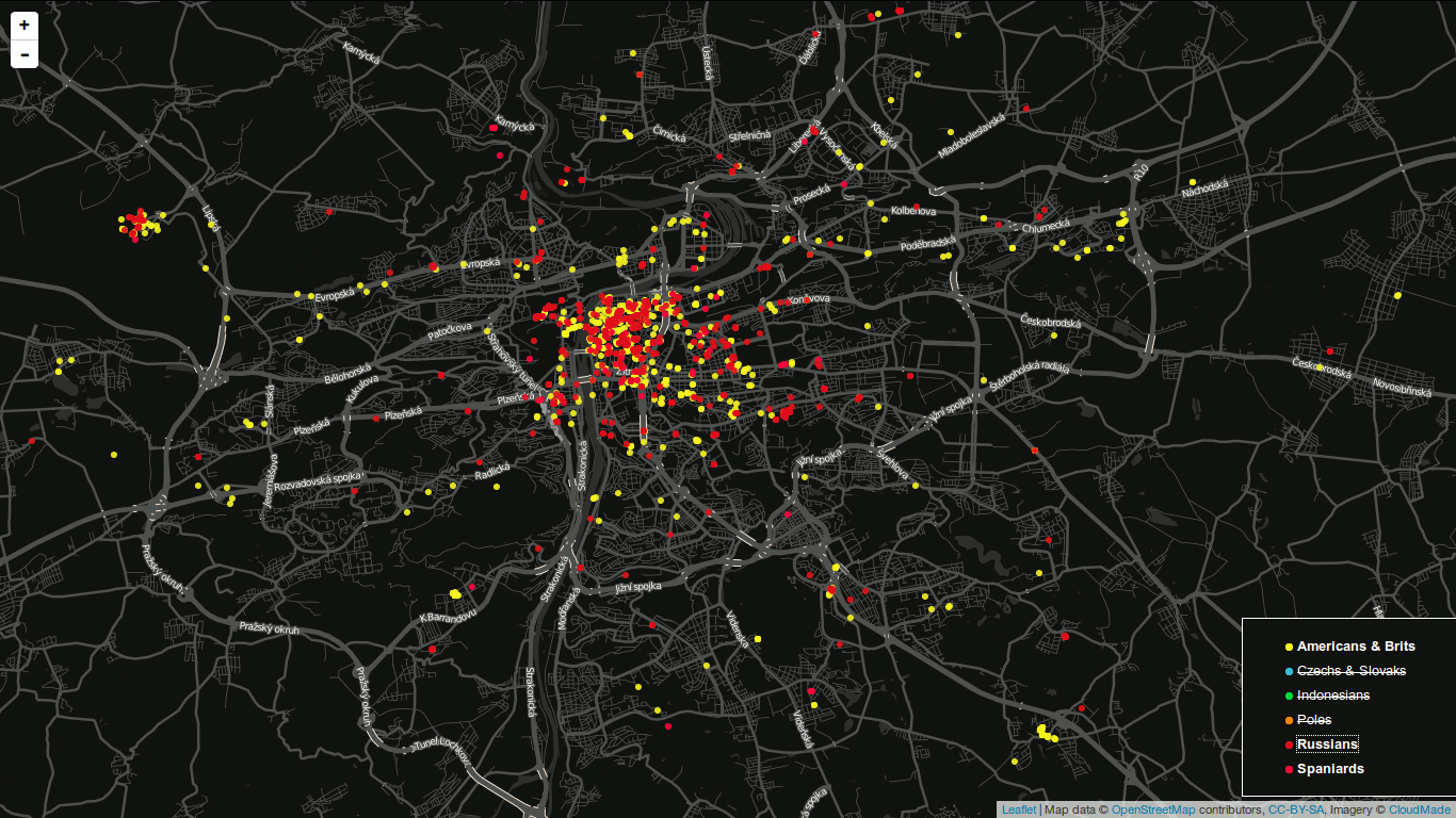
I am definitely willing to share the code and the final viz. Meanwhile, you can have a look at the screenshot on picture [*]. I have already implemented nationality switch (legend items are clickable) and I would like to add a day/night switch to see whether there are any differences between the peoples’ behaviour.

Figure: Final map screenshot. A legend is used to turn nationalities on and off. You are looking at Prague by the way.
Obviously the most tweets were sent from the most populated places, e.g. Prague, Brno, Ostrava.
Seeing Anita’s space-time cube back in 2013 was a moment of woooow for me. I’ve been interested in unusual ways of displaying data ever since I started studying GIS and this one was just great. How the hell did she make it?!, I thought back then.
And I asked her, we had a little e-mail conversation and that was it. I got busy and had to postpone my attemps to create that viz until I dove into my diploma thesis. So…here you go.
Recipe
What you need is:
- processing.py which is a Python port of processing environment.
- A basemap that fits the extent you are about to show in the viz. I recommend QGIS for obtaining an image.
- A JSON file with tweets you got via Twitter REST API (yes, the viz was made to display tweets).
- A python script I wrote.
How to make it delicious
First things first, you need to add a timestamp property to tweets you want to show (with the following Python code). created_at param is a datetime string like Sat Jun 22 21:30:42 +0000 2013 of every tweet in a loop. As a result you get a number of seconds since 1.1.1970.
def string_to_timestamp(created_at):
    """Return the timestamp from created_at object."""
    locale.setlocale(locale.LC_TIME, 'en_US.utf8')
    created_at = created_at.split(' ')
    created_at[1] = str(strptime(created_at[1], '%b').tm_mon)
    timestamp = strptime(' '.join(created_at[i] for i in [1,2,3,5]), '%m %d %H:%M:%S %Y') # returns Month Day Time Year
    return mktime(timestamp)
As you probably guess, the timestamp property is the one we’re gonna display on the vertical axis. You definitely want the tweets to be sorted chronologically in your JSON file!
#!/usr/bin/python
# -*- coding: utf-8 -*-
#avconv -i frame-%04d.png -r 25 -b 65536k  video.mp4

from peasy import PeasyCam
import json

basemap = None
tweets = []
angle = 0

def setup():
    global basemap
    global tweets

    size(1010, 605, P3D)

    data = loadJSONArray('./tweets.json')
    count = data.size()

    last = data.getJSONObject(data.size()-1).getFloat('timestamp')
    first = data.getJSONObject(0).getFloat('timestamp')

    for i in range(0, count):
        lon = data.getJSONObject(i).getJSONObject('coordinates').getJSONArray('coordinates').getFloat(0)
        lat = data.getJSONObject(i).getJSONObject('coordinates').getJSONArray('coordinates').getFloat(1)
        time = data.getJSONObject(i).getFloat('timestamp')

        x = map(lon, -19.68624620368202116, 58.92453879754536672, 0, width)
        y = map(time, first, last, 0, 500)
        z = map(lat, 16.59971950210866964, 63.68835804244784526, 0, height)

        tweets.append({'x': x, 'y': y, 'z': z})

    basemap = loadImage('basemap.png')

    cam = PeasyCam(this,53,100,-25,700)
    cam.setMinimumDistance(1)
    cam.setMaximumDistance(1500)

def draw():
    global basemap
    global tweets
    global angle

    background(0)

    # Uncomment to rotate the cube
    """if angle < 360:
        rotateY(radians(angle))
        angle += 1
    else:
        angle = 360 - angle"""

    # box definition
    stroke(150,150,150)
    strokeWeight(.5)
    noFill()
    box(1010,500,605)


    # basemap definition
    translate(-505,250,-302.5)
    rotateX(HALF_PI)
    image(basemap,0,0)

    for i in range(0, len(tweets)):
        strokeWeight(.5)
        stroke(255,255,255)
        line(tweets[i].get('x'), height-tweets[i].get('z'), tweets[i].get('y'), tweets[i].get('x'), height-tweets[i].get('z'), 0)

        strokeWeight(5)
        stroke(255,0,0)
        point(tweets[i].get('x'), height-tweets[i].get('z'), tweets[i].get('y'))

        strokeWeight(2)
        stroke(255,255,255)
        point(tweets[i].get('x'), height-tweets[i].get('z'), 0)
        lrp = map(i, 0, len(tweets), 0, 1)
        frm = color(255,0,0)
        to = color(0,0,255)
        if i < len(tweets)-1:
            strokeWeight(1)
            stroke(lerpColor(frm,to,lrp))
            line(tweets[i].get('x'), height-tweets[i].get('z'), tweets[i].get('y'), tweets[i+1].get('x'), height-tweets[i+1].get('z'), tweets[i+1].get('y'))

    # Uncomment to capture the screens
    """if frameCount > 360:
        noLoop()
    else:
        saveFrame('screens/frame-####.png')"""
You should be most interested in these lines:
x = map(lon, -19.68624620368202116, 58.92453879754536672, 0, width)
y = map(time, first, last, 0, 500)
z = map(lat, 16.59971950210866964, 63.68835804244784526, 0, height)
 They define how coordinates inside the cube should be computed. As you see,
 x is the result of mapping longitudinal extent of our area to the width of cube, the same happens to z and latitude, and to y (but here we map time, not coordinates).
The bounding box used in those computations is the bounding box of the basemap. Interesting thing about Processing and its 3D environment is how it defines the beginning of the coordinate system. As you can see on the left, it might be slighty different from what you could expect. That’s what you need to be careful about.
How does it look


 They define how coordinates inside the cube should be computed. As you see,